
From Add Item in Template Maintenance select the Table button shown here. |
Tables can be used to prompt the user to enter information which suits a row/column format. In general, up to 5 columns can be specified, each with an associated heading, percentage width and unique name. A button is shown which allows additional rows to be added to the table. A sixth “column” can be specified (without a % width) which will cause its value to be shown on the line below the current table row (this enables additional information to be shown against a selected row and can act as a visual confirmation of the selection, but it is only displayed for the current row and is removed when a new row is selected) |
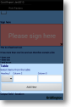
How your Table might look on a device. |
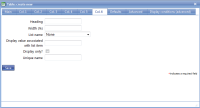
Main |
Main screen for creating/amending a Table |
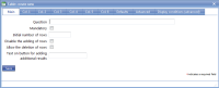
Main screen for creating/amending a Table |
|||||||
| *Question | This is the text “label” that is specifying the information that needs to be entered or the question to be answered. Although this is not necessarily a question in all cases, Question is used as the general term to cover the text shown next to an input field. The text should be as short as possible whilst still being self-explanatory. Over-long questions take up a lot of space on PDA screens with their restricted size, so try and make them concise. This text should be an aid to help guide the user through the screen. Any more explanatory text can be made available as “Auditor’s notes” or “Full question text”. | ||||||||
| Mandatory |
Tick this box if the question is mandatory and leave it blank if it is optional. This will depend on whether the answer to this question is critical to the data that is being collected, such as signature to confirm customer acceptance. |
||||||||
| Initial number of rows | Specifies how many rows are initially shown in the table. This can be used to save the user from having to repeatedly tap the ‘Add result’. By default there is 1 row in a table. | ||||||||
| Disable the adding of rows | Tick this box to prevent operators adding rows to the table. | ||||||||
| Allow the deletion of rows | Tick this box to enable the deletion of rows. | ||||||||
| Text on button for adding additional results | The wording on a button for additional rows. | ||||||||
Columns |
Create/amend columns in a Table. |
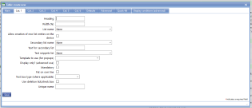
Adding or amending a column in a table. |
|||||||
| Heading | For each column, enter the text to be shown as the column heading. Bear in mind that this should be as abbreviated as possible due to the limited screen sizes on mobile devices. | ||||||||
| Width (%) | For each column enter the percentage width of the table that is to be allocated to the column (omitting the '%' symbol). This allows sensible formatting of the table. Bear in mind that the total widths of all the columns must add up to 100%. | ||||||||
| List name | Specify a standard list name in this field if you wish the user to select from a drop-down list rather than enter free text. See “List name” under the Drop-down list item for more details. | ||||||||
| Allow creation of new list entries on the device |
There may be situations where it is valid for a user to create their own list entries for a drop-down list. By ticking this box you will enable the user to select a “Create new” option from the drop-down (in addition to the standard list entries) and they will be able to specify the text value for the new entry. When the completed form is uploaded to the web site, the new list entry will be added to the associated list as though it had been specified by the administrator. The new entry will then be available for all users to select in future. |
||||||||
| Secondary list name (Column 1 only) | An additional list can be associated with the first column (eg. maybe it contains an expanded set of products). Usually the secondary list will contain all items in the initial list. This list is not displayed by default but can be enabled by the user by ticking an “enable secondary list” box shown below the table. Once a secondary list has been displayed, it is not possible to revert to the original list. | ||||||||
| Text for secondary list (Column 1 only) | The text to be shown next to the tick box which enables the secondary list. | ||||||||
| Text snippets list | See the “Text snippets list” under the Text item for full details. Typical usage would be in cases where, say, a product name is required but may require editing (compare this with a drop-down list where entries cannot be edited). | ||||||||
| Template to use (for popups) | A secondary template attached to this column. | ||||||||
| Display only? (advanced use) | Specifies whether the display value associated with the list item can be edited (as, for example, in the case of price lists). | ||||||||
| Mandatory | Tick this box if completion of this column is mandatory. | ||||||||
| Put on own line (column 1 only) | This puts column 1 on a separate line, allowing a heading style | ||||||||
| Text box type (where applicable) | Select the most appropriate text box type | ||||||||
| Use deletion tick/check box | Show a tick/check box for selecting rows to delete | ||||||||
| Unique name | Allocate a unique name to this column. | ||||||||
Column 6 |
A sixth “column” can be specified (without a % width) which will cause its value to be shown on the line below the current table row (this enables additional information to be shown against a selected row and can act as a visual confirmation of the selection, but it is only displayed for the current row and is removed when a new row is selected). Most items are as detailed above. |
A sixth “column” can be specified (without a % width) which will cause its value to be shown on the line below the current table row (this enables additional information to be shown against a selected row and can act as a visual confirmation of the selection, but it is only displayed for the current row and is removed when a new row is selected). Most items are as detailed above. |
|||||||
| Heading | For each column, enter the text to be shown as the column heading. Bear in mind that this should be as abbreviated as possible due to the limited screen sizes on mobile devices. | ||||||||
| Width (%) | For each column enter the percentage width of the table that is to be allocated to the column (omitting the '%' symbol). This allows sensible formatting of the table. Bear in mind that the total widths of all the columns must add up to 100%. | ||||||||
| List name | Specify a standard list name in this field if you wish the user to select from a drop-down list rather than enter free text. See “List name” under the Drop-down list item for more details. | ||||||||
| Display value associated with list item |
Specifies a “lookup” value (for instance, price or product name) associated with the selected list entry in a specified column. Values should be specified in the form columnUniqueName:lookupValue where columnUniqueName is the unique name given to the column which contains the relevant drop-down list and lookupValue is one of:
score – the numeric score/value associated with the list entry $priceList – the price associated with the list entry for the current customer (this involves the use of the customer’s price list attribute, something which is not enabled by default) attributeName – the name of an additional attribute available on the list in question (this is not enabled by default) |
||||||||
| Display only? | Specifies whether the display value associated with the list item can be edited (as, for example, in the case of price lists). | ||||||||
| Unique name | Allocate a unique name to this column. | ||||||||
Defaults |
Add/amend parameters for table default entries. |
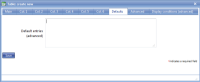
Add/amend parameters for Table default entries. |
|||||||
| Default entries (advanced) | A table can be pre-populated with one or more rows of data. These can be specified here. | ||||||||
Advanced |
Advanced features of a Table. |
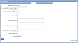
Advanced features that can be applied to a Table. |
|||||||
| Pre-fill data from job item | Select from the drop-down list to format job item (see below) related data in a table. | ||||||||
| Item name from device workflow | If table data is being populated from a device workflow then specify the name of the workflow item here. | ||||||||
| For quantity-related rows, force quantities to be greater than 0 | Tick this box if the quantities in the table should be greater than zero - in other words a positive number must be entered. | ||||||||
| Force table to take part in calculations | In some cases tables are used in calculations, for example in the calculation of totals. Most of the time this will happen automatically but sometimes this option is necessary to force tables to contribute to calculations. See your magic5 expert for more details. | ||||||||
|
Auditor's notes |
If you wish to offer the end-user guidance and direction on how to answer a question then use the Auditor’s notes field. This allows you to input any necessary text expanding on the basic question. For the end-user, the auditor’s notes are available via the “right click” option on the device – tap and hold the stylus on the question text. |
||||||||
|
Full question (for report) |
The question text mentioned above should be framed in such a way as to indicate to the user the information that needs to be input. However, when this information is output on a report via the web site or a PDF additional wording may well be required. Use this field to phrase the original question in a way suitable for the report. |
||||||||
|
Search information for drop-down (advanced) |
The first column in a table can have a search button if the column is list-based. This controls the screen showing search matches. Each line is a column. Within a line the values are:
Title;Item to show;Width
Item to show can be:
It is not possible to expand list item attributes within a list item. Here is a complex example: Reg;description;30% Make;XML:@asset_Make;20% Model;XML:@asset_Model;20% Serial;XML:@asset_SerialNo;20% A simple example would be: Item;description;100% |
||||||||
|
Don't keep previous result when part of a document lifecycle |
Tick this box if you DO NOT wish data to be collected in this template item to be copied to any jobs created directly from the original form. This is useful for a repeated task (such as booking in/out a rental item or repeated delivery) where the data remains the same but a sign-off is required so this box may be ticked for Date, Surname and Signature. Please note that if a transformation option is applied to the newly created job, this setting may be over-ruled. |
||||||||
| *Unique name |
A unique name must exist for everything in a magic5 template. It is so important that magic5 pre-fills the prompt with a non-meaningful name which it will use by default. This does not need to be changed. However, if the data associated with the unique name is to be used elsewhere (for example as part of a calculation, imported or exported, or carried over to a new job), it is helpful to use a meaningful name (such as RefNo, QuantityOrdered, ItemTotal, ContactName, ReasonForReferral) and this meaningful name must be entered before the template is used with real data. If the unique name is changed at a later date, existing data will not be lost but it may no longer be accessible by magic5, in which case it cannot be displayed, used in calculations or exported. It is therefore recommended that this is done only as a last resort and that the original template is duplicated before changes are made - this means that existing data can still be retrieved if necessary. If in any doubt, please contact magic5 support for the best way to deal with this. |
||||||||
Quick-fill |
Populate all rows in a table with the same entry. Alternatively copy results from a different table CopyTable:[un]:[col_un] |
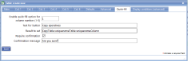
Image Title |
|||||||
| Enable quick-fill option for column number (1-5) | Select the column that is to be populated | ||||||||
| Text for button | Enter the text that will appear on the button | ||||||||
| Result to set |
Enter the result to set. This might be a fixed text such as 20%, the contents of another field such as @companyName or the results entered in a previous table, such as operatives working on site yesterday, with the syntax CopyTable:[unique name of table]:[unique name of column] |
||||||||
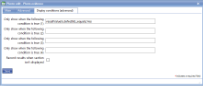
| Require confirmation | Tick this box if confirmation of the quick-fill is required | ||||||||
| Confirmation message | Enter the text to appear if confirmation is required | ||||||||
|
|||||||||